Page 6 of 7
Re: For lack of a better way..
Posted: 2010.09.12 (14:16)
by The Black Lion
You're just a fantastic guy Cooby...
What you do is incredible and I respect you a lot for that.
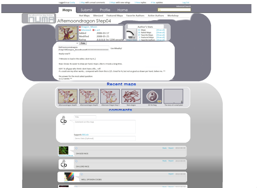
I just love the little bar at the top with comments/ratings/replies, does it is inspired by my “Notifications system” proposition? ;)
I’ve just a little hesitation. Maybe it would be nicer to see the number of new comments/ratings and not the number of maps with new c/r ?
The home page, active authors page and submit map page is more than perfect.
I like that you take my beta-area idea for create what you call the Workshop but i've use the beta-area system during 2 years and I want to tell you some advices. First, yes, for a lot of authors it will be the portal of maps submission, simply because people want comments on their maps. In the beta-area on Tmx, maps don’t have “thumbnail”. I really think it’s better to not show the thumbnail. People play a map according of the thumbnail, so it mean that not experimented authors will not get comment for getting better because of their thumbnails...
I like your “Nods” system but if you do that the Workshop will become the new hot maps page. I propose to just able people to comments, says “interesting idea” or “I don’t like the top right thwump”. After what the author can delete his map and repost it with a description like “changed the thwump and added a zap drone, I hope it’s better”. After 1 or 2 edits, the author release his map and say thanks at X and Y for playtesting in the description.
I very like Inspired’s idea to put a limit of 2 maps per authors, maybe add another limit like 1 map posted per day maximum.
I also very like the hot map page. The disposition looks a little messy but after some times it looks very clever ^^. But what about my proposition for a Time-Slotted/Top rated system? Top rated is a fusion of most rated and best rated and Time-slotted will categorize the maps in last 8 hours, day, week, month, year and all time. The combination of this two search system would be very interesting. I’ve talk about that in page 4 of this topic and in the “Proposition of new features to Numa” topic.
The Profil page is a little to full in my advice. The 10 most recent maps are a little useless because you have just to click on maps near the author’s avatar for getting this list. So I propose to delete that and make some place for the profile comments (show only 2 comments is quite useless too). Anyways I love the disposition of all others elements.
I hope you will have the courage to read all my post and I apologize for bad English. I compliment you again for this amazing work you do man. I also hope my advice could help you, just tell me what you think about.
Re: For lack of a better way..
Posted: 2010.09.13 (19:38)
by chocollama
I actually prefer the profile page Cooby's way.
Re: For lack of a better way..
Posted: 2010.09.13 (21:01)
by unoriginal name
Cooby is full of great ideas, but is he also full of sex? I think so.
Re: For lack of a better way..
Posted: 2010.09.14 (02:08)
by Cooby
The Black Lion wrote:I like that you take my beta-area idea for create what you call the Workshop but i've use the beta-area system during 2 years and I want to tell you some advices. First, yes, for a lot of authors it will be the portal of maps submission, simply because people want comments on their maps. In the beta-area on Tmx, maps don’t have “thumbnail”. I really think it’s better to not show the thumbnail. People play a map according of the thumbnail, so it mean that not experimented authors will not get comment for getting better because of their thumbnails...
I like your “Nods” system but if you do that the Workshop will become the new hot maps page. I propose to just able people to comments, says “interesting idea” or “I don’t like the top right thwump”. After what the author can delete his map and repost it with a description like “changed the thwump and added a zap drone, I hope it’s better”. After 1 or 2 edits, the author release his map and say thanks at X and Y for playtesting in the description.
I very like Inspired’s idea to put a limit of 2 maps per authors, maybe add another limit like 1 map posted per day maximum.
There is some good advice here and definitely a lot to consider. I'm glad I got your input considering you're the one with the most experience with this model. I don't think I'm gonna mess with it too much until after the contest ends and until we all know what the final design will be.
The Black Lion wrote:But what about my proposition for a Time-Slotted/Top rated system? Top rated is a fusion of most rated and best rated and Time-slotted will categorize the maps in last 8 hours, day, week, month, year and all time. The combination of this two search system would be very interesting. I’ve talk about that in page 4 of this topic and in the “Proposition of new features to Numa” topic.
I agree, I'd like to see the Top Rated system come back with those changes.
The Black Lion wrote:The Profil page is a little to full in my advice. The 10 most recent maps are a little useless because you have just to click on maps near the author’s avatar for getting this list. So I propose to delete that and make some place for the profile comments (show only 2 comments is quite useless too). Anyways I love the disposition of all others elements.
Do you mean the Top 10 Maps? 'Cause those aren't the most recent maps necessarily. I think you mean the recent maps section with the 6 most recent maps though. I feel that those thumbnails need to be there visually in order to attract a decent amount of attention. And as for the comments, the profile page is supposed to be all about the author. That's the reason I only showed 2 comments with the option to show all on a separate page.
Re: For lack of a better way..
Posted: 2010.09.17 (17:21)
by Destiny
You make it sound like you have competition XD
Re: For lack of a better way..
Posted: 2010.09.17 (19:31)
by chocollama
Destiny wrote:You make it sound like you have competition XD
which is definitely NOT the case
Re: For lack of a better way..
Posted: 2010.09.17 (20:31)
by Ferox
I like your changes, Cooby. They're like an iPhone: sleek, light, and an aura of coolness.
Re: For lack of a better way..
Posted: 2010.09.20 (04:00)
by rocket_thumped
Congratulations Cooby
Re: For lack of a better way..
Posted: 2010.09.20 (04:40)
by SkyRay
If i could suggest my idea that i implemented in my design (that i had no time to work on)
I had the general idea of being able to rate/comment/play from the hot maps page, or other pages without having to go into the map
Basically separate tabs for each
First tab would basically be what we see now (possibly with the map data as well, if not in another tab), second tab would include a comment/rate section, third tab could include map data, or other comments
If i could do this i'm sure me, and many others would be much more inclined to post comments and demo's, even play maps more often
Sometimes i don't play maps just because i'm too lazy to go into the map page
Re: For lack of a better way..
Posted: 2010.09.20 (08:35)
by Pig2
Holy shit Cooby, that is some amazing stuff. I am looking forward to this design being implemented. I have a couple of suggestions and/or comments however:
First, on the map page you have reduced the number of recent maps displayed to 3, which I have no problem with. However, can we PLEASE display subsequent maps as well (maps made after the current map). It is so frustrating having to browse through an author's entire archive just to play the next map that the author made.
Also, I am glad that you propose to bring bitesizing back, but why not format the bitesize page in a similar way to the hot maps page? Sure you might not be able to see so many but I think it's good to be able to view the map info still.
Also, will there be a list of page numbers that you can click on when browsing an authors maps? That is, something that says "Page: [1] [2] [3]" etc. and you just click on the number?
Also, can you make it so that maps can be arranged in a certain order. Eg. most recent first, most recent last, highest rated first, etc.? That might be difficult to implement but I think it would make browsing so much easier.
I think that's all. Well done on the great work, and I really hope this is implemented soon!
Re: For lack of a better way..
Posted: 2010.09.20 (10:46)
by im_bad_at_n
What about trivial things? Or are they too obvious:
1) Map data is also accepted to post in comments where demo data is now (same spot). Or even multiple demos/data on the same comment?
2) Rating system: still 0-5? .5 ratings? It might mess up the whole rating system if it was changed though.
3) Favorite authors: Is that still a firefox extension (or similar) or will that be implemented from your design to the actual site? Sounds like the latter.
4) Where the blank comment section is, before submitting. Having it before the comments will be easier, since I really hate how to refer to the newer comments requires scrolling up and down, and more reference to newer instead of older.
5) The reply to a comment part... Who posted when, as in the order of the comments, will be awkward. Especially when replying to a reply. AND when replying, where would the blank comment be? right under the comment you're replying too or the bottom of the page, etc?
Other than those, I feel the workshop is a little unappealing to me, but for newer authors I can see how this would be amazing and create a friendly environment for them. The profile ROCKS. Especially the 10 maps chosen by the author to be on display. And the comments. And ... everything! I also like the possibility to experience bitesized firsthand too, not get 50 slightly different definitions of it :P
With Destiny you were debating about the recent maps by this author part of a map's page. 'numamap3copy.jpg' and 4copy have alternates of what would be there... but what if the entire section of the maps comments was shifted to the right half, while keeping the map info on the left? That way comments are even more visible without scrolling (side effect).
Lastly I guess are skins... I like a lot of them, and if this comes out, I can't really single any out in particular that I really want.. except the classic mode (the one for those resistant to change... not me really, but just to kick back to the classic view would be neat). But what's everyone's problem with having more than three options to choose from? Unless it's compromising and will take up a lot of (too much) data on the web server I don't have any problem with it. --It would also be neat if one can view the skin the author was using based on their profile page, as in a color scheme they use visible to others when they view their profile, or is that too much?
Re: For lack of a better way..
Posted: 2010.09.20 (12:10)
by lsudny
Cooby.
You are awesome.
One question though - why both featured and bitesized maps? Would they differ somehow, in quality, tiles, gameplay or something like that?
Oh, and iban made some good points.
Re: For lack of a better way..
Posted: 2010.09.20 (16:14)
by a happy song
I love your ideas for functionality improvements cooby, I guess I'm the only one who dislikes your aesthetic designs...
it's all very slick, but there's just too much white. It looks empty, clinical, like a the bones without the skin.
It's just too glaring, imo.
If you're going to implement more skins, perhaps you could try some with darker backgrounds too?
Re: For lack of a better way..
Posted: 2010.09.20 (16:43)
by Kablizzy
a happy song wrote:I love your ideas for functionality improvements cooby, I guess I'm the only one who dislikes your aesthetic designs...
it's all very slick, but there's just too much white. It looks empty, clinical, like a the bones without the skin.
Every good website in the world is clinical. And even some of the bad ones, too. :P
Re: For lack of a better way..
Posted: 2010.09.20 (16:54)
by Miststalker06
Wow, Cooby. Good job! Very, very pleasing aesthetics on the site. Good, simple design. (I like honeybee the most)
That being said, I wanted to know, whether you have thought of implementing a system, which shows the Authors' top 10 maps in the Active Authors page?
And THAT being said, I think everything else is terrific. As one other said, include the top rated maps on the profiles page and the site would be perfect.
Thanks for that awesome sketch, man.
EDIT:
Had to stand by IBAN on some of those points...
Multiple demos in one single comment is a magnificent idea! I know that when I play maps, I like to submit both an AGD and a speedrun.
The comments box HAS to be above the comments. I whole-heartedly agree... I think the contemporary solution is annoying.
I also think that the skin the author on a profile is using should be displayed a either some text or a tiny image. Nothing big, just for fun! :)
EDIT2:
@Pig2:
I second Pig2 on the bitesize-thing... Sure, the other thing is better, but having too many different designs on one site is frustrating.
Stick with the simple stuff.
@SkyRay:
I think the map data on the hot maps page is a great idea. I agree on being too lazy to do other than that.
Re: For lack of a better way..
Posted: 2010.09.20 (17:10)
by Vyacheslav
I like Cooby's design too, just the background should be a light gray/beige, not pure white.
Re: For lack of a better way..
Posted: 2010.09.20 (20:50)
by 大見解
well, what if you tried to implement a way to select which colors you want as a palette?
Re: For lack of a better way..
Posted: 2010.09.20 (21:07)
by n0_ma11y
Maby something a little more like boxed in like this:
Re: For lack of a better way..
Posted: 2010.09.20 (21:34)
by a happy song
n0_ma11y wrote:Maby something a little more like boxed in like this:
Yuk. Too cartoony.
Sorry to be so picky, but I spend a fair amount of time on the site. Simply giving the current design a skin with a light grey background would be more than enough.
Re: For lack of a better way..
Posted: 2010.09.20 (23:49)
by heatwave
Not a fan of Cooby's redesign. Sorry.
Re: For lack of a better way..
Posted: 2010.09.21 (00:44)
by Theodore_owens_^
heatwave wrote:Not a fan of Cooby's redesign. Sorry.
Don't worry, your opinion does not matter.
Re: For lack of a better way..
Posted: 2010.09.21 (01:37)
by otters
Theodore_owens_^ wrote:heatwave wrote:Not a fan of Cooby's redesign. Sorry.
Don't worry, your opinion does not matter.
This here is irony.
Re: For lack of a better way..
Posted: 2010.09.21 (05:10)
by remm
incluye wrote:Theodore_owens_^ wrote:heatwave wrote:Not a fan of Cooby's redesign. Sorry.
Don't worry, your opinion does not matter.
This here is irony.
Wahahahahahaha
Cooby, congrats. I love the design and would be happy to see it implemented, especially the Workshop idea.
Re: For lack of a better way..
Posted: 2010.09.21 (05:53)
by amomentlikethis
I hope that "x maps with new ratings" thing doesn't get implemented.
I hope that mine (and others') profiles get fixed.
I hope that user stats can come back, those were fun.
The design looks nice though. Will be a welcoming change to have a light-themed NUMA again.
Re: For lack of a better way..
Posted: 2010.09.21 (10:37)
by otters
amomentlikethis wrote:I hope that "x maps with new ratings" thing doesn't get implemented.
That would be way hard/unnecessary to implement anyway, I think, unless you wanted to overload your ratings table with unnecessary columns and do all this redundant flag-setting shit and eh.