So here's my second map, and my first published map: not so fast..
This was inspired by the fact that if you have a lazorb drone moving past a half-tile slit, you get a deadly laser that turns on and off periodically - a common obstactle in platform and action games. I also liked the variation on this that I used a few times in classic maps, the same setup but with a laser drone. Stepping on the floor turns it deadly for a length of time just shorter than the time it takes to complete a fully blown jump.
This is one of the things about the new objects in N++, I find that we finally have enough freedom with them to pretty much make anything. I could not think of any other types of enemy or object to add to N++ because you can do so much with specific combinations and usages of the existing objects. That's smart game design!
Here's a video of my first completion of the level after submission:
https://www.youtube.com/watch?v=ybra7hEJlYk
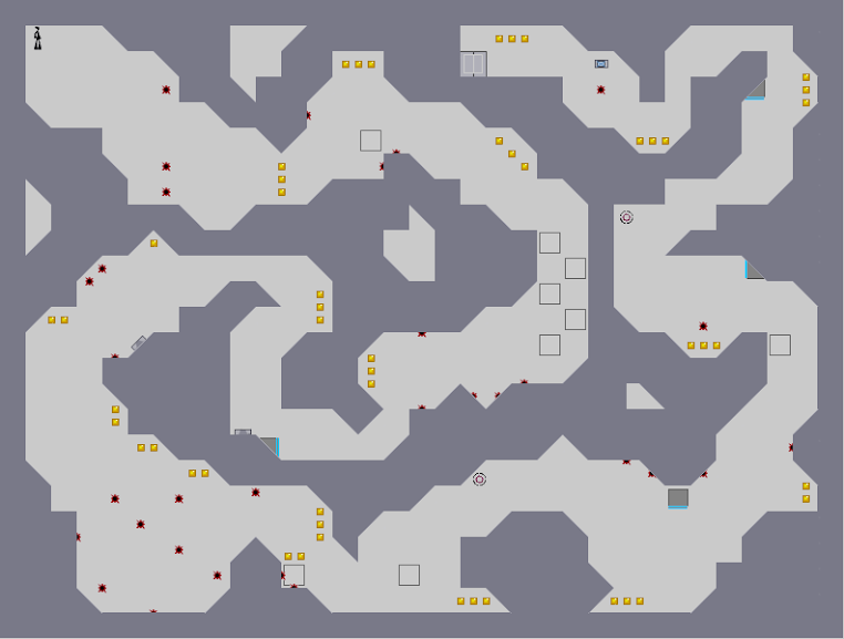
And here's an annotated image I made.
Initially I started with the middle floor with the laser creating that timed deadly floor, the wall with the mines slap bang in the middle, and the three vertical normal drones. Then I created the top floor as something fairly easy to build up to the main challenge of scooting under that wall with the laser drone charging up. The part with the mini drones is a miniature version of the main drone layout, to create some theming consistency, and the room on the top left combines both timed lasers with ninja-activated ones in an optional gold challenge on the way to the main room.
Afterwards I added the third level down with the lazorb creating a periodically deadly floor, and put some islands to rest on in safety. I decided to make this bit quite easy as the main challenge was over.
Around about this time I noticed that you could get the switch next to the drones on the main floor without actually touching the right wall. So, I created a big cache of gold, and added switches on that wall, any one of which will block off that gold.
The final stretch to the exit was just something to sign the level off, a last bit of tension with optional gold over the exit.
Now, back to that diagram.
The lines in the image show how I used local symmetry to make the map look nicer. Originally, the line of symmetry going right down the middle of the level didn't exist, but I found that if I pulled the central features of each floor a tile or two one way or the other, I could line everything up. I find that in non-symmetrical levels, having these areas of limited, local symmetry makes maps look nicer, and easier to parse during gameplay.
The other lines in the diagram show other instances of symmetry that I fashioned, in an attempt to balance the composition.
A1 and A2 are pointing to a problem I have, where I have two different types of mine layouts - the polka-dot "net" variety (A2) and the solidly filled variety (A1). Personally, I wish I had kept A1 to a polka-dot style layout, as all the other mines adopt this fashion. Perhaps I get away with it, as it is the focal point of the entire level, with the exit switch being underneath it, but I think changing the mines wouldn't really reduce that impact.
The part labelled B is an instance of one-ways up against slanted tiles. In N, players would be able to pass the wrong way through here, as the slanted tile would "push" them through, but in N++ this has been fixed. Just something I noted.
Label C - the door. I wish I'd moved it right a tick, so that when open, you can see both door panels. This is a very minor thing.
Label D - look! Floor guards now work on half-tiles! I've found in general that each tile appears to be split into four sub-tiles, each with their own solid/empty state, at least for the smaller enemies like floorguys and micro drones. This is a really awesome addition to the N++ engine.
As a final flourish, I added some useless empty space, a sort of "visual echo" coming off from the exit door, and added the same motif in the upper right. I think it looks pretty neat.
All in all, I was pleased with this as a first publication. It's similar to my old style of maps, but toned down and a bit more readable. Something of a Metanet influence, and a positive one, I think :)