Ironically, I can't see the image atm given what computer I'm on, but thanks for the advice and w/e. Tbh, I did kind of rush that because I was under a lot of time pressure, and I'd done eveyrthing else I wanted with the sig apart from the text. I probably thought of it as an afterthought at the time, which was my undoing :/Manus Australis wrote:Can I help you out with text placement on the aperture sig? Thanks.
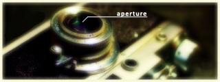
See what I did here? To compliment the image better, I cleverly labeled where the aperture of the camera is.
Not only does it look stylish, it's a really small thing that made the image a whole lot better. The text you placed, GTM, was not only large and kinda ugly (though the blur effect to tie in with the rest of the image was good), it didn't even follow the line of the bottom of the camera exactly!
I also made another version where I had one letter of "aperture" in a different layer and then went about rotating each single piece of text slightly so that it followed the curve around the camera lens.
I was also going to label the camera with "aperture" but have the letters be upside-down and place it between those two round parts on the face of the camera.
There are a lot of things you can do with text, I just think that telling you what you could do wouldn't be quite as helpful as if I just showed you.
Izzy's right in that I don't usually blend renders into my sigs, but I'd probably able to do that with the text. I do use layers and stuff, if I'm giving the impression otherwise.
Apse, pointless post.