Page 1 of 9
Uzi's Images
Posted: 2008.12.28 (04:04)
by Universezero
I'm taking requests for sigs and avatars; use the following template, or just ask for whatever:
Dimensions: (Width in pixels x Height in pixels)
Colour Scheme: (Main colours)
Renders: (Specific images or renders)
Complexity: (Simple, Indepth)
Matching Avatar: (Yes or No, be sure to specify avatar dimensions unless you want it 100x100)
I also do wallpapers occasionally; just tell me the size you want and what you want; I may make it or photograph it.
Re: Universezero's Images
Posted: 2008.12.28 (04:26)
by Brainwasher
pretty sweet, I'll have one, whichever style you think fits best, but I can't really give tips because I hve no idea how to make one. I also don't have any criticisms.
Pretty much, this is good
Re: Universezero's Images
Posted: 2008.12.28 (04:27)
by T3chno
Reminds me of myself in GIMP when I first got, in fact, some of the sigs look eerily similar. There's one thing you need to improve on first: a focus. The focus should not be the text, unless circumstances require it to be so. Try going to
Planet Renders by picking up some renders, and work around them.
Re: Universezero's Images
Posted: 2008.12.28 (04:29)
by Universezero
Thanks T3chno, I appreciate it.
Here's yours, brainwasher.

Simple; I don't expect you to love it.
Re: Universezero's Images
Posted: 2008.12.28 (10:09)
by origami_alligator

This one is by far your best up there. I agree with T3chno: the font shouldn't be the main focus of a signature.
What I like about the bright one is that it gives the effect that if you look at it dead on it just looks very light green, but when you look slightly away from it you can see all the variations of color and design in it. It's very nice.
What I would hope from you is to continue on in that kind of style for a while and see how that suits you, then branch off and try different things as new ideas and techniques become familiar to you. The rest of the signatures are all very blah and unoriginal. Keep doing stuff like this one and I'll probably be proud to call you a great image maker, though that title is reserved for those who really push hard to become good at this art.
I'm not the best here (some disagree) but I sure do have some tips for image making. Keep making images and I might leave you some tips!
-southpaw-
Re: Universezero's Images
Posted: 2008.12.28 (12:47)
by behappyy
All your sigs are good. I just don't like some of the text.
Re: Universezero's Images
Posted: 2008.12.28 (14:44)
by Eiturlyf
UniverseZero wrote:
That is
awesome.
Especially the lighting.
Re: Universezero's Images
Posted: 2008.12.28 (17:40)
by Donfuy
UniverseZero wrote:
Love this one, especially the font.

I like this one; it can be any number of things.

The first one is awesome, but I don't really like the font.
The second is awesome too, but the sun is a little bit too...*can't find the word*... well, it needs more blur, perhaps. Notice that this is a critic made by an incompetent image... viewer.
Re: Universezero's Images
Posted: 2008.12.28 (21:21)
by Brainwasher
hahaha I do like it & the simpsons
Re: Universezero's Images
Posted: 2008.12.28 (23:16)
by Universezero
@ southpaw: Thanks for the advice, I really need it at this stage. And, I know this is going to disappoint you, but for the bright one I used a render. Sorry.
@ Donfuy: Those ones you quoted on were the first that I actually made the image from scratch without a render. Those are the ones I'm going to try do more of. And yes, I now kinda know what you mean with the sun. It's too sharp in contrast with the rest of the image.
@ Brainwasher: Thank you! I really didn't think you'd use it.
EDIT: I decided to make this to make up for the bright one that I spent almost no time on. I made it from a cloud render, but I made all of the effects.

Re: Universezero's Images
Posted: 2008.12.29 (00:42)
by Universezero
Something new, totally original. Thoughts?

EDIT: Another. Critique.

Re: Universezero's Images
Posted: 2008.12.29 (07:20)
by origami_alligator
UniverseZero wrote:@ southpaw: Thanks for the advice, I really need it at this stage. And, I know this is going to disappoint you, but for the bright one I used a render. Sorry.
No worries. Renders are a good thing to know how to use and you used that one effectively. Basically, even after all the rabble and crap that I spit out about renders and C4D's and tutorials, the basic thing that I always come back to is "If you can make a good image, it doesn't matter how you made it."
This second image is well done. Scan lines have kind of dropped out of style (they were really popular in the forum back in late 2007 / early 2008), but you used them well. One thing to watch out for is scan lines making other parts of the sig look odd and mangled, such as what happened around the text. If you look at the image you'll notice that up and to the right basically in the middle of the sig there is a blank spot where the scan lines fade out and there's a nice area there for text to go. That would have been a better choice.
Blending text is something that you'll probably have to work on for a while before you actually start getting it, but finding a nice place to put text until you learn how to blend text effectively is good to know. Keep up with the light sigs, dude, I'm really enjoying them more than all your other stuff. Of course, please experiment, but I think your strength right now lies in lots of shine and bright colors.
Re: Universezero's Images
Posted: 2008.12.29 (23:13)
by Universezero
Thanks pawz.
Here's some new ones.


Darker Version

Re: Universezero's Images
Posted: 2008.12.29 (23:57)
by Brainwasher
pretty sweet 3-D effects
Re: Universezero's Images
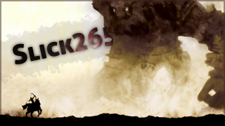
Posted: 2008.12.30 (02:03)
by Pixon
Could I possibly get one like that explosion one that you just posted?
Re: Universezero's Images
Posted: 2008.12.30 (02:11)
by T3chno
UniverseZero wrote:
I like what you're doing - trying something new. I realize you didn't do much to the text for a signature effect (an amazing C4D though, by the way).
What you could have done here to improve this:
-Change the angle of the font so it
flows* with the sig.
-Give the text another color, preferable gradients of variations from the sig's primary colors.
-Make this into a square sig and use main body of C4D.
Just realized the last one was horrible advice, which goes directly against my previous thoughts on the sig. >_>
*Flow is important. Follow where the sig is heading. In this case, it's bursting outward, primarily toward the south/southwest region. So your text should look similar to it.
Definitely improving fast.
Re: Universezero's Images
Posted: 2008.12.30 (08:28)
by origami_alligator
Like I said before, I see a lot of potential from you. Keep up with the good work! I'm sure in no time you'll be as talented as some of the fan favourites in this forum.
Re: Universezero's Images
Posted: 2009.01.03 (01:46)
by Universezero
Thanks guys, I'll keep working on it. In the meantime, more sigs!


And here's yours Laurie.

Open for requests.
Re: Universezero's Images
Posted: 2009.01.03 (12:59)
by Pixon
That is so fucking sick. So fucking sick. My mind is blown.
Re: Universezero's Images
Posted: 2009.01.05 (07:36)
by Universezero
Laurie wrote:That is so fucking sick. So fucking sick. My mind is blown.
Thanks.
New ones:

I also need some help with smuging; I can't seem to be able to successfully merge layers together. Any tips?
Re: Universezero's Images
Posted: 2009.01.07 (02:23)
by Superpok
userbar, map, and now an avater...
Dimensions: same as my current one
Colour Scheme: light and dark blues, whites
Renders: Mountains
Complexity: like most of your other ones, where you can look at it and get the gist, but when you look closer, you see more
Matching Avatar: no, but i'd still like an avatar
text: Santa Hat Crusader (Santa Hat on the first S)
Other: could you try to make it at either sunset (with the sun just barely peaking over) or midnight (moonless with clouds)
Avatar: any or all
a) Ninja with Santa Hat
b) Mountains
c) Ninja
d) Santa Hat
Re: Universezero's Images
Posted: 2009.01.07 (03:04)
by Universezero
Re: Universezero's Images
Posted: 2009.01.08 (09:21)
by Universezero
New one:

Superpok, I'll have finished yours by tomorrow hopefully.
EDIT: Done!

||

Re: Universezero's Images
Posted: 2009.01.08 (22:06)
by Pixon
Can I get another, with something that will blow my mind again?
Re: Universezero's Images
Posted: 2009.01.08 (23:29)
by Universezero
Laurie wrote:Can I get another, with something that will blow my mind again?
Certainly Sah.